Keyboard
Class:
ScreenBoard.
Adaptive on-screen keyboard with a couple of supported languages.
- Simple example
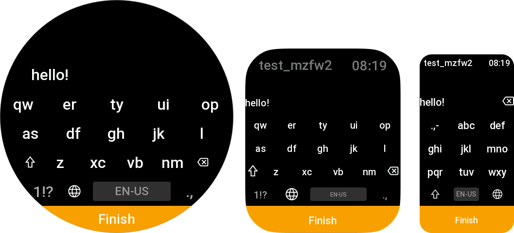
- From screenshot
page/index.js
import { ScreenBoard } from "mzfw/device/ScreenBoard";

Page({
    build() {
        const board = new ScreenBoard({});
        board.onConfirm = (value) => {
            console.log("confirm clicked:", value);
        };
        board.visible = true;
    }
})
page/index.js
import { ScreenBoard } from "mzfw/device/ScreenBoard";
import { UiTheme } from "mzfw/device/UiCompositor"

// Custom theme for keyboard
class MyTheme extends UiTheme {
    ACCENT_COLOR_DARK = 0xFFA000;
}

Page({
    build() {
        // Create keyboard with custom theme
        const board = new ScreenBoard({
            theme: new MyTheme(),
        });

        // Keyboard options
        board.title = "Test keyboard";
        board.confirmButtonText = "Finish";

        // Value managment
        board.value = "hello!";
        board.onConfirm = (value) => {
            console.log("confirm clicked:", value);
        };

        // Show keyboard now
        board.visible = true;
    }
})
Compatibility
All ZeppOS devices are supported.
Features
- Three layouts:
T9,T14andQWERTY; - Multiple language support;
- Can be used within compositor or without;
- Built-in settings screen;
- Theming support (see device theming guideline).
Reference
new ScreenBoard(options)
Create a new ScreenBoard instance with provided options.
options is an object that may contain following properties:
theme: UiTheme: theme that will be used for keyboard design & sizing;forceRenderer: string: force set renderer ID, may bet9,t14orqwerty;forceLayouts: string[]: force set keyboard layout IDs.
title: string
Property. Text that will be displayed when value is empty.
confirmButtonText: string
Property. Text shown on confirm button bellow the keyboard.
visible: boolean
Property. If set to true, keyboard will be rendered and shown. If false
(default), it will be hidden
value: string
Property. Current keyboard screen value.
onConfirm(value: string): any
Method. Will be called when user click to confirm button bellow the keyboard. Can be overridden.