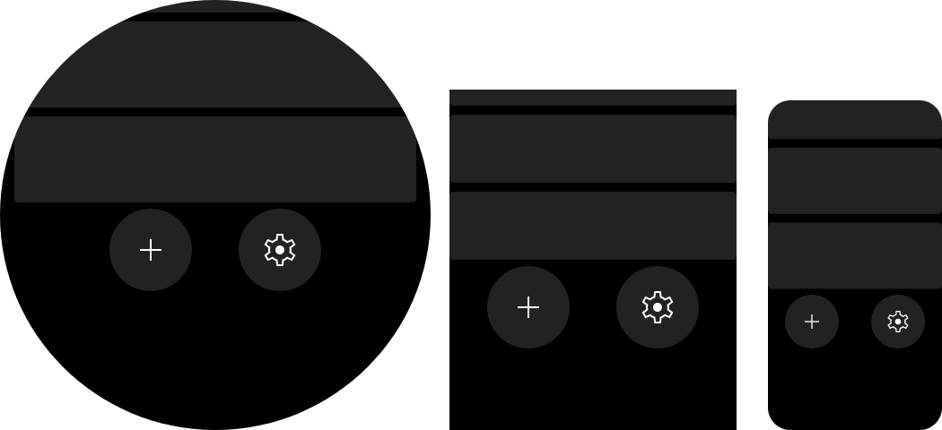
Action bar
Class:
ActionBar.
This component provides set of icon buttons. Each button have their icon & click handler.
Component can be focused by wheel scroll, it will switch between buttons inside with them and call onClock on wheel short click.
import { ListView } from "mzfw/device/UiListView";
import { ActionBar } from "mzfw/device/UiActionBar";
import { spawnPlaceholders } from "mzfw/device/DocumentationDemos";

class MyPage extends ListView {
  build() {
    return [
      // Some grey squares, for preview
      ...spawnPlaceholders(),

      // Action bar and their items
      new ActionBar({
	    children: [
	      {
	        icon: "add",
	        onClick: () => console.log("onAdd"),
	      },
	      {
	        icon: "settings",
	        onClick: () => console.log("onSettings"),
	      },
	    ]
      }),
    ];
  }
}

Page(ListView.makePage(new MyPage({})));
Use cases
Component is designed to be used as action or tool bar, located at top or at bottom of page, not as header/footer. Recommended count of buttons is 1-2, but it can contain any count of them — buttons will be placed in multiple rows.
Design & layout
Buttons will be listed from left to right, if not fit into component width – in multiple rows. Background colors can be provided in properties, if not provided — them will be loaded from compositor’s theme.
Required icon sizes:
| Icon size | Device model(s) |
|---|---|
| 48 px | All devices |
Items also can be disabled, which will make it opaque, prevent their focus with wheel and disable onClick handler.
Compatibility
No issues or limitations known.
Properties
children: ActionBarItem[]
Button children descriptions.
ActionBarItem interface:
icon: string– Icon file name without extension, should be saved in app assets:$ASSETS/icon/$ICON_SIZE/$NAME.png;disabled?: boolean— is item disabled,falseby default;onClick(): any— item click handler.
backgroundNormal?: number
Normal button background color. Optional.
backgroundSelected?: number
Selected button background color. Optional.
backgroundDisabled?: number
Disabled button background color. Optional.