Headline button
Class:
HeadlineButton
This component provides a small button with width-depending design. It contain icon and title, which will be visible only if there’s enough space on screen.
Component can be focused by wheel, their click will call onClick() callback.
import { ListView } from "mzfw/device/UiListView";
import { HeadlineButton } from "mzfw/device/UiButton";
import { spawnPlaceholders } from "mzfw/device/DocumentationDemos";

// NOTE: That's import for zeusx. If you're writing for zeus, use instead
// const { align } = hmUI;
import { align } from "@zosx/ui";

class MyPage extends ListView {
  buildHeader() {
    // Headline button
    return new HeadlineButton({
      text: "Settings",
      icon: "settings",
      onClick: () => {
        console.log("onSettings");
      }
    });
  }

  build() {
    return [
      // Grey rectangles, for preview
      ...spawnPlaceholders(5),
    ];
  }
}

Page(ListView.makePage(new MyPage({})));
Use cases
This component is designed to be used in header and/or footer of ListView compositor. It can be used to provide out-of-context page action, example to open “About this app” or settings dialog.
Design and layout
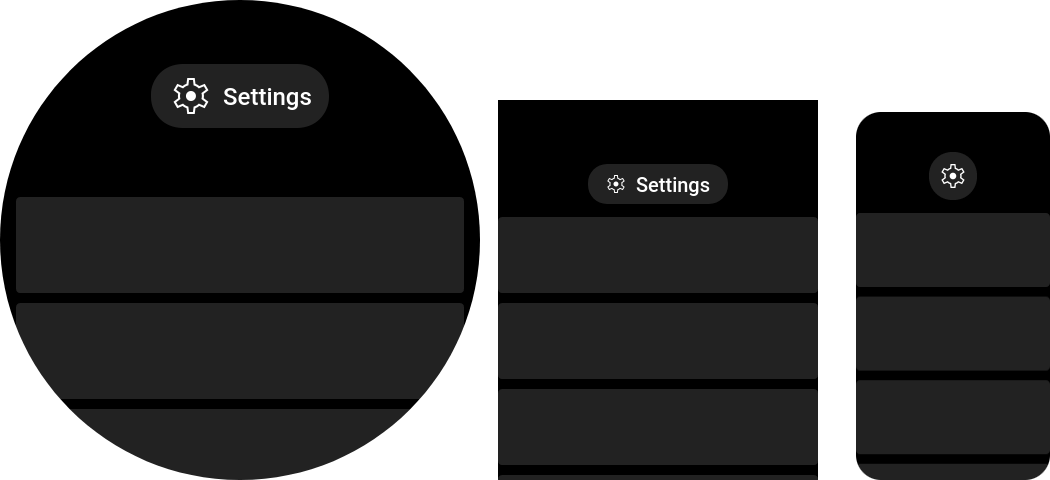
This component has three layouts:
- Icon button without title for screen smaller than 200 px;
- Small icon and title for screen smaller than 380 px;
- Large icon and title for large screens.
Used in this component icon should be available in following sizes:
| Icon size | Device model(s) |
|---|---|
| 32 px | GTS 4 Mini, Bip 5 and other with IS_SMALL_SCREEN_DEVICE flag |
| 48 px | Band 7, Mi Band 7 and all other devices |
Compatibility
No issues or limitations found.
Properties
text: string
Button text, visible on large screens.
icon: string
Icon file name without extension. Icon should be located in app assets: $ASSETS/icon/$ICON_SIZE/$NAME.png.
onClick?(): any
Button on click handler. Optional.
textColor?: number
Button text color. Optional, default loaded from theme BUTTON_TEXT.
backgroundNormal?: number
Normal button background color. Optional, default load from theme BUTTON_NORMAL.
backgroundSelected?: number
Selected button background color. Optional, default load from theme BUTTON_SELECTED.
backgroundPressed?: number
Pressed button background color. Optional, default load from theme BUTTON_PRESSED.