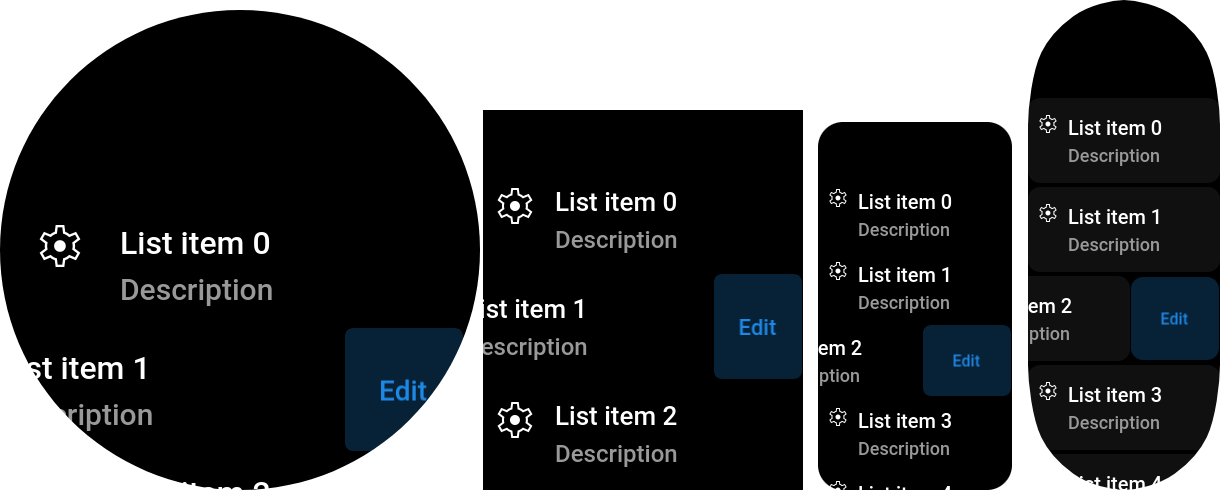
List item
Class:
ListItem
This component provides common list item view. It is a clickable row with title, description and icon (all optional). Based on Paper component, so you can use their extra features, including extra button.
This item can be selected & clicked via spin wheel. Short wheel click
will call onClick(), long — onSecondActionClick().
import { ListView, ListItem } from "mzfw/device/UiListView";

class MyPage extends ListView {
  build() {
    // Generate a set of 6 ListItem's
    const out = [];

    for(let i = 0; i < 6; i++) {
      out.push(new ListItem({
        // Visible properties
        title: `List item ${i}`,
        description: "Description",
        icon: "settings",

        // Second action button
        secondActionName: "Edit",
        onSecondActionClick: () => {
          console.log(`onEdit`);
        },

        // Click handler
        onClick: () => {
          console.log("onClick");
        },
      }))
    }

    return out;
  }
}

Page(ListView.makePage(new MyPage({})));
Use cases
Designed to be used in ListView compositor. This component is designed to be used as an entry in any list of data entities, or in app settings. But you can also use it as an advanced button, or as visible part of input/select field.
Design & layout
Background is inherited from Paper component, and in default settings is black for Amazfit devices, and grey for Mi Band 7. Text & background colors by default are nested from compositor's theme, and can be overridden in properties. Font size is also read from theme, for description it will be less by 2px.
Icon used in this component should be available in following sizes:
| Icon size | Device model |
|---|---|
| 24 px | Amazfit Band 7, Mi Band 7 |
| 48 px | Other devices with SCREEN_WIDTH < 380 |
| 56 px | Other devices |
By default, item icon is located at left of title & description, but you can move it to right via iconPosition property. Automatic component height equals to full height of component contents with extra padding
Compatibility
- This component can’t be destroyed in Amazfit Band 7, Mi Band 7, due to their ZeppOS implementation bugs.
Properties
title?: string
List item title, by default, displayed as first text row in component. Optional.
icon?: string
Icon file name without extension. Icon should be located in app assets: $ASSETS/icon/$ICON_SIZE/$NAME.png. Optional.
description?: string
List item description text, by default, placed bellow title. Optional.
iconPosition?: "left"|"right"
Where to place icon: at left or right from text. Optional, default to "left".
titleColor?: string
Item title color. Optional, by default will be loaded from compositor's theme.
descriptionColor?: string
Item description text color. Optional, by default will be loaded from compositor's theme.
onClick()?: any
Item click callback, will be called on short paper click.
Inherited properties
paperRadius?: number
Background round radius.Optional, default to built-in ListItem style.
secondActionName?: string
Hidden button text, see paper component guide.Optional.
onSecondActionClick()?: any
Hidden button click & wheel long click callback. Optional.
paperBackgroundNormal?: number
Normal background color. Optional, default loaded from theme.
paperBackgroundSelected?: number
Selected (by wheel) background color. Optional, default loaded from theme.
paperBackgroundPressed?: number
Pressed background color. Optional, default loaded from theme.
paperBackgroundMarginH?: number
Extra horizonal margin for component.
paperBackgroundMarginV?: number
Extra vertical margin for component.